suppressPackageStartupMessages( library(tidyverse) )

plate_cols <- tibble(
  plate_column = 1:12,
  used = c( FALSE, rep(TRUE, 10), FALSE ),
  content = c( "empty", rep( "co-culture", 8 ), rep( "target cells only", 2 ), "empty" ),
  subject = c( NA, rep( c( "C1", "P1", "C2", "C3" ), 2 ), rep( NA, 3 ) ),
  aphidicolin = c( NA, rep( TRUE, 9), FALSE, NA ),
  n0_target_cells = c( 0, rep( 12000, 10), 0 ),
  n0_t_cells = c( 0, rep( 12000, 4), rep( 24000, 4), rep( 0, 3 ) ),
) Lösung zur Übung: Ein “Killing-Assay” zur Untersuchung von Immunschwäche
Wir beginnen mit dem Code aus der Aufgabenstellung:
Dieser erzeugt folgende Tabelle mit der Spalten-Belegung der Mikrotiter-Platte:
plate_cols# A tibble: 12 × 7
plate_column used content subject aphidicolin n0_target_cells n0_t_cells
<int> <lgl> <chr> <chr> <lgl> <dbl> <dbl>
1 1 FALSE empty <NA> NA 0 0
2 2 TRUE co-culture C1 TRUE 12000 12000
3 3 TRUE co-culture P1 TRUE 12000 12000
4 4 TRUE co-culture C2 TRUE 12000 12000
5 5 TRUE co-culture C3 TRUE 12000 12000
6 6 TRUE co-culture C1 TRUE 12000 24000
7 7 TRUE co-culture P1 TRUE 12000 24000
8 8 TRUE co-culture C2 TRUE 12000 24000
9 9 TRUE co-culture C3 TRUE 12000 24000
10 10 TRUE target cel… <NA> TRUE 12000 0
11 11 TRUE target cel… <NA> FALSE 12000 0
12 12 FALSE empty <NA> NA 0 0Zur Bedeutung der Spalten, siehe Aufgabenstellung.
Die Beschreibung des Zeilenlayouts erfassen wir durch folgende Tabelle:
# A tibble: 8 × 3
  plate_row used  conc_anti_cd3
  <chr>     <lgl>         <dbl>
1 A         FALSE            NA
2 B         TRUE              0
3 C         TRUE              0
4 D         TRUE              1
5 E         TRUE              1
6 F         TRUE              5
7 G         TRUE              5
8 H         FALSE            NA
Nun laden wir die Tabelle:
read_delim( "data_on_git/GFP_object_count_perImage20221020withIL2.txt", delim="\t", skip=6, local=locale(decimal_mark=",") ) -> table_raw

table_raw
# A tibble: 10 × 242
`Date Time` Elapsed `B2, Image 1` `B2, Image 2` `B2, Image 3` `B2, Image 4`
<chr> <dbl> <dbl> <dbl> <dbl> <dbl>
1 20.10.2022 1… 0 245 196 283 185
2 20.10.2022 2… 2 275 184 305 199
3 20.10.2022 2… 4 272 210 321 208
4 21.10.2022 1… 6 272 217 321 226
5 21.10.2022 3… 8 295 226 313 208
6 21.10.2022 5… 10 310 237 344 232
7 21.10.2022 7… 12 331 289 328 255
8 21.10.2022 9… 14 303 301 403 278
9 21.10.2022 1… 16 364 296 452 280
10 21.10.2022 1… 18 426 368 563 353
# ℹ 236 more variables: `C2, Image 1` <dbl>, `C2, Image 2` <dbl>,
# `C2, Image 3` <dbl>, `C2, Image 4` <dbl>, `D2, Image 1` <dbl>,
# `D2, Image 2` <dbl>, `D2, Image 3` <dbl>, `D2, Image 4` <dbl>,
# `E2, Image 1` <dbl>, `E2, Image 2` <dbl>, `E2, Image 3` <dbl>,
# `E2, Image 4` <dbl>, `F2, Image 1` <dbl>, `F2, Image 2` <dbl>,
# `F2, Image 3` <dbl>, `F2, Image 4` <dbl>, `G2, Image 1` <dbl>,
# `G2, Image 2` <dbl>, `G2, Image 3` <dbl>, `G2, Image 4` <dbl>, …Der nächste Schritt war, die Tabelle in Langform zu pivotieren:
table_raw %>%
select( -1 ) %>%
pivot_longer( -1, values_to="count") %>%
rename( "hours_incub" = "Elapsed" ) -> tbl_intermediate

tbl_intermediate
# A tibble: 2,400 × 3
hours_incub name count
<dbl> <chr> <dbl>
1 0 B2, Image 1 245
2 0 B2, Image 2 196
3 0 B2, Image 3 283
4 0 B2, Image 4 185
5 0 C2, Image 1 278
6 0 C2, Image 2 224
7 0 C2, Image 3 174
8 0 C2, Image 4 189
9 0 D2, Image 1 168
10 0 D2, Image 2 207
# ℹ 2,390 more rowsNun übernehmen wir den Code aus der Aufgabenstellung, um die Spalte name zu zerlegen:
tbl_intermediate %>%
mutate( matches = as_tibble( str_match( name, "(.)(..?), Image (.)" ) ) ) %>%
unnest( matches ) %>%
select( hours_incub, plate_row = V2, plate_column = V3, image_no = V4, count ) %>%
mutate( image_no = as.integer(image_no) )  %>%
mutate( plate_column = as.integer(plate_column) ) -> tbl_long

tbl_long
# A tibble: 2,400 × 5
hours_incub plate_row plate_column image_no count
<dbl> <chr> <int> <int> <dbl>
1 0 B 2 1 245
2 0 B 2 2 196
3 0 B 2 3 283
4 0 B 2 4 185
5 0 C 2 1 278
6 0 C 2 2 224
7 0 C 2 3 174
8 0 C 2 4 189
9 0 D 2 1 168
10 0 D 2 2 207
# ℹ 2,390 more rowsDie nächste Aufgabe war, die jeweils vier Anzaqhl-Werte aus demselben Well zur selben Messung zu addieren:
tbl_long %>%
group_by( hours_incub, plate_row, plate_column ) %>%
summarise( count = sum(count) ) -> tbl_long_per_well

tbl_long_per_well
# A tibble: 600 × 4
# Groups: hours_incub, plate_row [60]
hours_incub plate_row plate_column count
<dbl> <chr> <int> <dbl>
1 0 B 2 909
2 0 B 3 981
3 0 B 4 794
4 0 B 5 964
5 0 B 6 907
6 0 B 7 914
7 0 B 8 781
8 0 B 9 1007
9 0 B 10 817
10 0 B 11 944
# ℹ 590 more rowsDer Plot zu den Monokulturen wirdn durch folgenden Code erzeugt:
tbl_long_per_well %>%
left_join( plate_rows ) %>%
left_join( plate_cols ) %>%
filter( content == "target cells only" ) %>%
filter( used ) %>%
mutate( conc_anti_cd3 = factor( conc_anti_cd3 ) ) %>%
mutate( well = str_c( plate_row, plate_column ) ) %>%
ggplot +
  geom_line( aes( x=hours_incub, y=count, group=well, lty=aphidicolin, col=conc_anti_cd3 ) )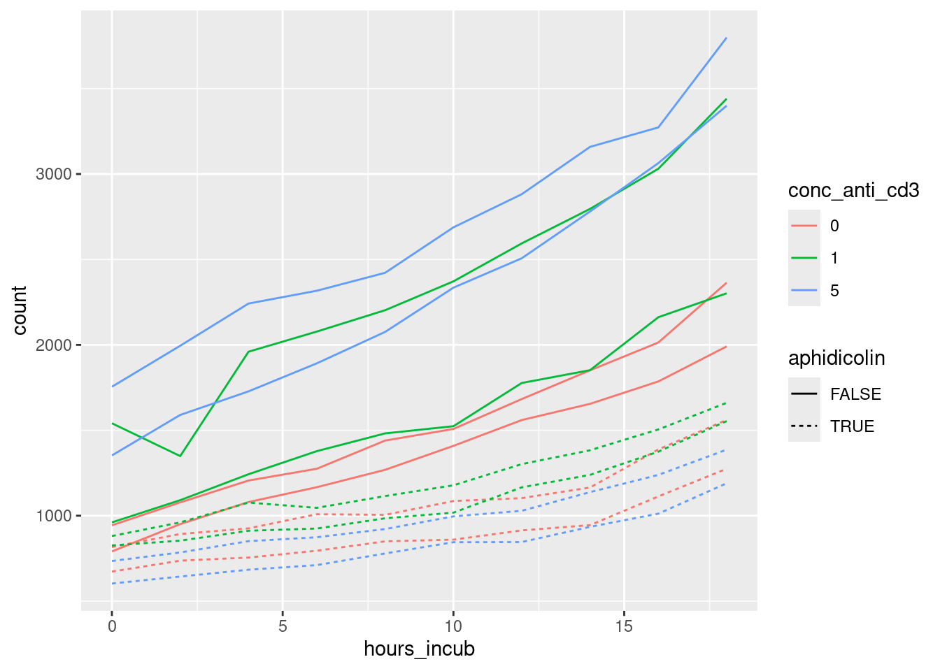
Zwei Punkte sind nicht trivial im Code für diesen Plot: Zum einen haben wir die Spalte conc_anti_cd3 in einen Faktor umgewandelt. Das bewirkt, dass die Spalte als kategorische statt kontinuierliche Variable aufgefasst wird. Dann werden die drei Konzentrationswerte durch drei verschiedene Farben, statt nur drei Blautöne, dargestellt. Zum anderen brauchen wir eine Spalte, in der die alle Werte zum selben Well den gleichen Wert haben. Dazu fügen wir mit str_c Platten-Spalte und Platten-Zeile zur Well-Bezeichnung zusammen. Dies verwenden wir dann in aes für group, so dass jede Linie genau die Werte aus einem Well verbindet.
Die nächste Aufgabe war, eine Tabelle mit den Zellzahlen zum Zeitpunkt 0 zu erzeugen. Dazu filtern wir anhand der Spalte hours_incub und wählen die benötigten Spalten. Vorher müssen wir noch die Gruppierung vom vorigen Code-Chunk wieder aufheben.
tbl_long_per_well %>%
ungroup() %>%
filter( hours_incub == 0 ) %>%
select( plate_row, plate_column, count_at_0 = count ) -> tbl_counts_at_zero

tbl_counts_at_zero
# A tibble: 60 × 3
plate_row plate_column count_at_0
<chr> <int> <dbl>
1 B 2 909
2 B 3 981
3 B 4 794
4 B 5 964
5 B 6 907
6 B 7 914
7 B 8 781
8 B 9 1007
9 B 10 817
10 B 11 944
# ℹ 50 more rowsUm nun die Werte in der langen Tabelle durch die Werte zum Zeitpunkt 0 zu teilen, fügen wir die eben erzeugt Tabelle an und führen dann die Division durch:
tbl_long_per_well %>%
left_join( tbl_counts_at_zero ) %>%
mutate( count_ratio = count / count_at_0 ) -> tbl_long_norm
Nun können wir den Plot von eben nochmals erzeugen, nun aber normalisiert auf die Baseline:
tbl_long_norm %>%
left_join( plate_rows ) %>%
left_join( plate_cols ) %>%
filter( content == "target cells only" ) %>%
filter( used ) %>%
mutate( conc_anti_cd3 = factor( conc_anti_cd3 ) ) %>%
mutate( well = str_c( plate_row, plate_column ) ) %>%
ggplot +
  geom_line( aes( x=hours_incub, y=count_ratio, group=well, lty=aphidicolin, col=conc_anti_cd3 ) )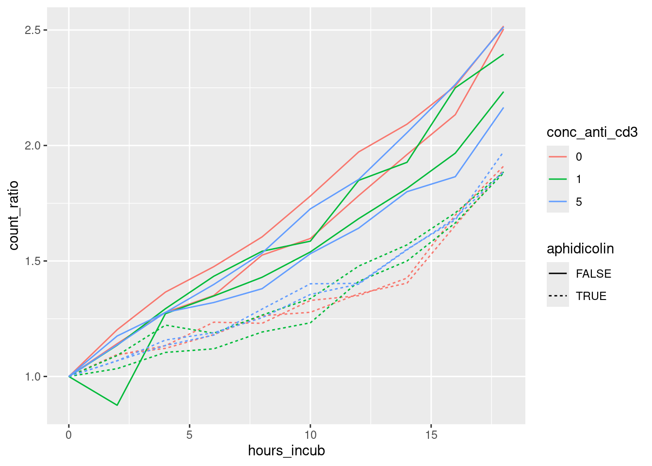
Wir fügen noch ein + scale_y_log10 hinzu, um die y-Achse logarithmisch zu skalieren:
tbl_long_norm %>%
left_join( plate_rows ) %>%
left_join( plate_cols ) %>%
filter( content == "target cells only" ) %>%
filter( used ) %>%
mutate( conc_anti_cd3 = factor( conc_anti_cd3 ) ) %>%
mutate( well = str_c( plate_row, plate_column ) ) %>%
ggplot +
  geom_line( aes( x=hours_incub, y=count_ratio, group=well, lty=aphidicolin, col=conc_anti_cd3 ) ) +
  scale_y_log10()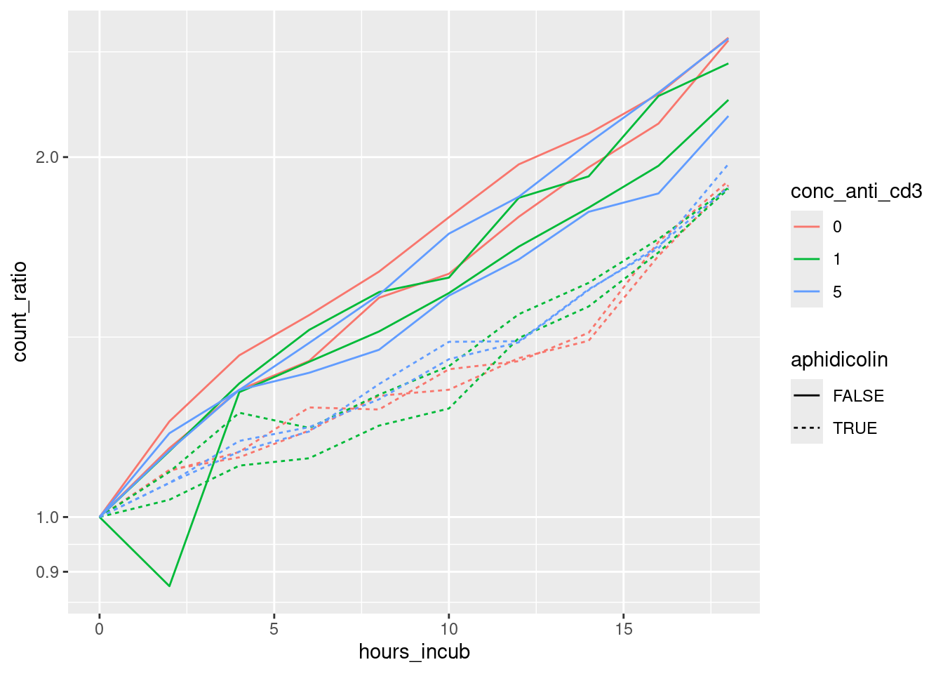
Interpretation:
- Wir sehen exponentielles Wachstum. (Gerade Linien im halb-logarithmischen Plot.)
- Das Aphidicolin hemmt das Wachstum, unterbindet es aber nicht völlig. (Gestrichelte Linien haben geringere Steigung.)
- Die Konzentration von Anti-CD3 hat keinen merklichen Einfluß auf das Wachstum. (Die Linien mit verschiedenen Farben sind durchmischt.) Die Anti-CD3-Beschichtung beeinflusst die Targetzellen also nicht in einer Weise, die die Interpretation des Kokultur-Assays verfälschen könnte.
Den Plot für die Kokulturen erzeugen wir wie folgt:
tbl_long_norm %>%
left_join( plate_rows ) %>%
left_join( plate_cols ) %>%
filter( content == "co-culture" ) %>%
filter( used ) %>%
mutate( conc_anti_cd3 = factor( conc_anti_cd3 ) ) %>%
mutate( well = str_c( plate_row, plate_column ) ) %>%
ggplot +
  geom_line( aes( x=hours_incub, y=count_ratio, group=well, col=conc_anti_cd3 ) ) +
  facet_grid( n0_t_cells ~ subject ) +
  scale_y_log10()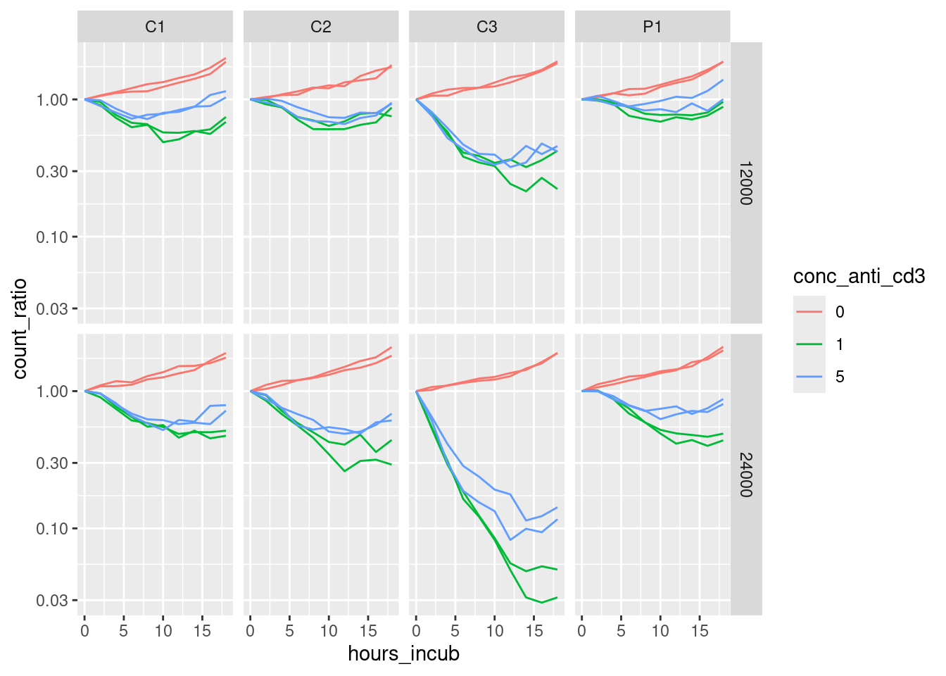
Interpretation:
- Ohne CD3-Belegung greifen die T-Zellen die Targetzellen nicht an.
- Die Stärke der CD3-Belegung scheint aber keinen großen Unterschied zu machen.
- Wenn man mehr T-Zellen einbringt, werden auch mehr Targetzellen vernichtet.
- Die T-Zellen des Probanden C3 sind viel aggressiver als die der anderen drei Probanden.
- Der Patient unterscheidet sich aber nicht sonderlich von den vergleichsprobanden C1 und C2.
- Der durch dieses Assay gemessene Effekt kann die Symptome des Patienten also leider nicht erklären.